|
From Alan Bowman and David Thomas, The Vindolanda Writing Tablets
(Tabulae Vindolandenses II), London: British Museum Press,
1994. pp. 49-52
The letter-forms12
a The vast majority of occurrences are in the form
shown in col.1; the left-hand diagonal is not infrequently extended
well below the line and may end in a curve. The form illustrated
in col.2 occurs in several tablets, usually together with that in
col.1 (e.g. 181,
218,
224,
252,
344,
345),
and may reasonably be considered a survival of an older form. The
extra stroke may be just a curve on the end of the right-hand diagonal
(e.g. 321;
see also address script (Vol. II,
Ch. 4) or may be quite long (e.g. 324
and especially 186);
in one or two instances, notably 169,
312.back,
325,
330,
cf. 139,
181.7
and 258,
it is written across the angles between the diagonals, so that the
letter superficially resembles a capital. We have found no further
instances of the very interesting form of the letter found in 341
(see fig.11.3 in Tab.Vindol.I (Vol.
I Ch. 4)) and already commented on in Tab.Vindol.I
(Vol. I Ch. 4, nor even of the
form found in 225.22,
amicis, which is on the way towards
this 'uncial' type of a.13
For ligature with l and u
see below.
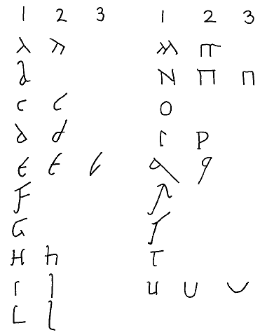 |
Fig. 1
Table of letter-forms
Image ownership:
© Trustees of the British Museum |
b All examples in our tablets are of the standard ORC type. There is a squat variety and one with a very tall ascender, but none shows the loop or bow at the right of the hasta as was to become the norm in NRC. The loop may in fact be written under the hasta (e.g. 158 and 310) so as to give an impression of an NRC b but the letter is still formed in the normal ORC manner.14
c The form which resembles a modern c is shown in col.1 and the more usual form, in two strokes, in col.2. In this form the top stroke may be extended considerably.
d Of the two forms that in col.1 may reasonably be considered the older, since that in col.2 is very like the one which was to be used in NRC. Both occur regularly throughout the tablets with perhaps a tendency for the form in col.1 to predominate in the documents and that in col.2 to be more common in the letters. It is noteworthy that a few tablets show the same writer using both forms, e.g. 255 and 294; also 218, where the letter is always made in a single movement (as is sometimes the case elsewhere for d in the form shown in col.1). The form in col.2 naturally easily ligatures to the right.
e The
form in col.1, normally made in three strokes but occasionally in
four (e.g. 152),
is obviously very close to the capital; the top stroke is often
extended. The form in col.2, in two strokes, is much the most common.
Only rarely, if at all, do we find the very cursive single-stroke
version shown in col.3 in the body of a letter (possibilities are
266.1,
323.1
and 328.1).
However, it is not at all uncommon in closing greetings, see 247,
285,
295,
301,
310;
note also the draft letters 225,
227
and 317,
and the names of the senders on the backs of 263
and 298.
In Tab.Vindol.I
we referred to a form in two halves, which we considered distinctive
for the development of this letter into its NRC version. We are
no longer confident that this form of e
occurs in any of our tablets.15
f There is a very remarkable form in 180 and 344 (the work of the same writer) in which the top stroke is entirely missing. A similar form seems to occur in 186.19 and 22.
g The same writer uses a rather odd form of g in two curves, rather like some forms of s (180 and 181). The tail of the letter can differ in different scripts; it is often somewhat prolonged, e.g. 178 and 343, cf. 307.a.2.
h The form shown in col.1, which is obviously close to the capital form, occurs several times (e.g. in 143, 260.back, 299, cf. 218), but less frequently than that shown in col.2. This latter form often has the horizontal stroke extended, sometimes but not always in order to facilitate ligature. This second stroke may be ligatured to the first stroke, in which case it starts at the foot of the upright (e.g. 168, 196.15, 236, 245.back, 347.a.1).
i The short form (col.1) frequently has a noticeable serif at top right, so that the letter can readily be confused with p or even t. The long form is commonest at word ends (often here in the ligature bi) and at the beginning of words, but is by no means confined to these usages. The form of the letter bears no apparent relationship to the length of the vowel.
l Both the forms illustrated occur frequently (the former usually with serifs) and some writers use either form indifferently (e.g. 297 and 316). The form in col.2 can be quite tall and can also descend well below the line, often in a diagonal direction.16 l is frequently found in ligature with a following a, in which case it is often written above the level of the other letters (see 192.4, 299.i.1, 315.2, etc).
m The basic form, as illustrated in col.1, can in fact be made in two, three or four strokes, of which the last is sometimes horizontal. The form in col.2 is perhaps made rather differently and this may be significant for the later development of the NRC form. It is rare in the tablets and usually confined to ligatures in closing greetings (see 247, 248, 258, 288).
n The forms illustrated in col.1 and col.2 occur with equal frequency throughout and very often in the same tablet (e.g. 164 and 292). In both varieties the stroke joining the two uprights may project a long way to the left. The form in col.3, which is probably made differently from that in col.2, is rare and, like the form of m in col.2, is usually found only in closing greetings; see 247, 248, 258, 288.17
o Nearly always made in two halves, as illustrated. The second stroke can curve the "wrong" way, when the letter can resemble c, see, e.g., 233, 310.i.11, 312; it can also resemble one form of d, cf. especially 302.3. In this version it often ligatures with a following letter, especially with r.
p The form in col.2 is only found rarely, notably in 151, 324, 258 (second hand) and 262 (where the normal form also occurs).18 A form which approaches this is to be seen in 186.9 and in the name of the sender in 341.
q The form in col.1 is no doubt the older form, but it is our impression that it occurs in our tablets more or less as frequently as the form in col.2, though there is probably a tendency for the documents to use the form in col.1 and for the letters to use that in col.2.19 It may be significant that (unlike d) we can quote no clear instance of the same writer using both forms, though this may occur in 255 (contrast ii.11 with q elsewhere) and 300.i.4 and ii.8.
r There is no apparent basic difference in any of the occurrences of this letter in our tablets, although the top stroke in one or two writers is so curved as to illustrate clearly the derivation of the cursive from from the capital (see 138, 186, 204.b.1, 215.5, 324). The descender can be prolonged to a considerable extent and usually curves at the foot.
s Again there is, we think, only one basic form in our tablets, though this can be made in one or, much more often, in two strokes; the single stroke version can be almost a straight diagonal line (cf. the remarks above on the capital script in 206). On the us ligature see below.
t Note the ligature with following i in 180.5 and 11, where an extra link stroke is used.
u The forms illustrated in col.1, col.2 and col.3 are all common and sometimes occur alongside one another in the same tablet (e.g. 184, 213, 310, 316). The form in col.3 is no doubt basically the same as that in col.2, but that in col.1 may be different.20 The form in col.3 is occasionally flattened out into an almost straight line when used in ligatures (ua, um, ur), e.g. 245, 255.4, 294.3, 315. In ligatures with following letters, especially a and s, u can lose its right-hand half, e.g. oua 193.5, tuam 274, several occurrences in uale written by a second hand, and once with ualere used in the body of a letter, 311.i.3; for us cf. 248.3 and 291.9, and for ur 291.7.21
|